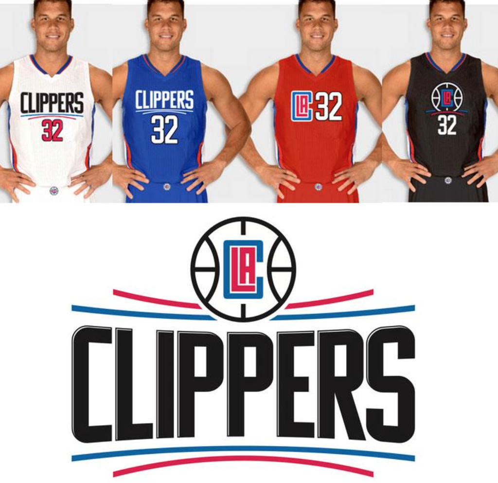
It does look a little like a logo for a tech firm or something but I kind of like it. The red and blue have a nice contrast to one another and you can see it clearly. I like the block letters and the red and blue lines as well. The whole effect seems pretty modern and clean.

No comments:
Post a Comment